sRGB to HSV - Science or Magic?

Update 21/04/26: You can find the accompanying talk to this topic by clicking this link
Recently, I was automating colour generation for a theme engine, which sparked a question
“Why do I instinctively lean towards a HSV Colour picker when trying to pick a colour on my computer?”
Investigating a little further into the “why” of how computers work, brings me immense joy. By the end of this piece, I hope to provide insight into what helped me understand colour space, colour transformations and what they can represent in digital form.
The Brief
Section titled “The Brief”From a programming standpoint, the problem I was looking to solve was fairly simple.
This is the high level summary:
- Take seed colours (Primary, Secondary, Tertiary, Neutral and Semantic).
- Ensure the colour set has an
isDarkflag to help deal with contrast and shades for a “Dark Mode” colour scheme. - Generate shades of each colour and label 100,300,500,700,900 with 100 being the lightest and 900 being the darkest (if you use
tailwindcssthis might already be familiar to you). - Compile our colours into a list of variables to be imported at the parent level of a CSS file (example `-primary-100: #222222;).
And my intuition immediately lead to:
- Obtain our seed colour hex codes.
- Convert to a HSV value.
- Have a set of standard transforms based on the colour scheme flag (
isDarkso we can apply the right contrast ratios). - Apply transforms and reconvert to hex with results ready to append.
The reason for my intuition came from having played with HSV values (in a visual tool like a colour picker) in the past. I already knew they were the right choice for this exercise, I had just never looked into why.
 Source: Material Design: Tools for Picking Colour
But before I do that we need to cover some of the introductory content to this space. If you want to jump straight into the meat and bones feel free to skip ahead to The RGB Colour Model.
Colour is Sensed and Perceived
Section titled “Colour is Sensed and Perceived”Colour is the translation of light sensed by the human eye and perceived by the brain.
Colour literature has roots dating as far back as 322 BCE (Aristotle’s - On Colours). Many of the concepts and standards we will come to discuss are tied to Isaac Newton’s extensive work on colour theory stating that white light is composed of a spectrum of colours, and colour is not intrinsic to objects, but rather arises from the way an object reflects or absorbs different wavelength.
Newton also discovered that sunlight is composed of 7 primary colours which are visible when passed through a prism: Red, Orange, Yellow, Green, Blue, Indigo and Violet. (fun fact: Newton added Indigo to ensure the 7 colours were aligned to musical notes Do, Re, Mi, Fa, Sol, La, Ti)
An average healthy human eye can see around 100 million different colours.
This is due to the three cone cell types (photoreceptors) found in the retina which can process ~100 different colour shades, amounting to ~one million combinations.
Fun Fact: The same biological factors can be observed in the animal kingdom, with the number of cone cells being varied. As an example some species of fish are considered to have double cones where as others might have four cones. The result of less or more cell types changes the way colours are perceived.
 Source: American Academy of Ophthalmology
The human eye has light-detecting neurons in the retina (rods and cones) that convert light into electrical signals for vision. The rods handle dim light and black/white vision and the cones are responsible for colour and sharp daytime vision. The human eye can perceive more variations in warmer colours rather than cooler ones due to a higher mix of cones that process longer light wavelengths (reds). These cone cells are classed as L, M and S (Long, Medium and Short)
The estimated split of cone cells in a human eye are:
- 60% Red Sensing L (these cones technically peak in the yellow-green part of the spectrum)
- 30% Green Sensing M
- 10% Blue Sensing S
Variations in this make up means a different perception of colour with a deficiency being considered a root cause of colour blindness.
In summary the process looks like this:
- Light hits photopigments in the photoreceptors outer segment
- The absorption starts a biochemical chain reaction (transduction)
- This changes the cell’s membrane potential and creates an electrical signal
- The signal is passed along through cells to the optic nerve and then brain
With this some of the biology out of the way lets dive a little more into computers and colour. Because our perception is so tied to these biological quirks—like our heightened sensitivity to green and red—computer programmers needed a way to translate the ‘sensing’ into reproducible data. This is where standards come in.
Standards, Standards, Standards
Section titled “Standards, Standards, Standards”In doing my research an article I discovered had three poignant quotes that are worth repeating (as I am a fledging in this space and can see the depths to which this topic can lead).
CIE colorimetry isn’t even half the story of colour science, it’s a tiny piece of the huge puzzle of human perception and engineering that is colour science. Don’t confuse understanding it with understanding colour perception.
Colorimetry is essentially linear algebra, human perception is much more complex. CIE colorimetry isn’t the whole story of colorimetry. It’s the modern standard but the theoretical work was done by James Maxwell in the 1850s.
Differentiating theoretical colorimetry from the CIE’s implementation of it will be a milestone in your understanding. I recommend : Jan Koenderink’s Color For the Sciences
Source: A Beginner’s Guide to (CIE) Colorimetry
The CIE (Commission internationale de l’éclairage) an over 100 year old organisation is the peak body providing a forum, developing international uniform standards and cooperating with interwoven fields related to the following categories (within the context of light and colour):
- Light
- Lighting
- Photobiology
- Vision and Colour
- Image Technology
- Measurement
Specifically around Image Technology they focus on bridging the gap between how we can make printed and display images match what we see. This includes methods, measurements and quantifiable ways of processing analogue or digital reproductions of colour.
CIE 1931 Colour system
Section titled “CIE 1931 Colour system”The CIE 1931 Chromaticity Diagram (below) “represents” the full gamut of human colour perception. Funnily enough depending on how the chart is presented you are also going to be limited by the colour space that it was rendered in (more on this shortly). It is a mathematical model and is a “static idealisation” i.e. what is theorised to be the colour vision of a normal human.
 The diagram has a few elements to consider:
- The outer curved boundary is the spectral (or monochromatic) locus - it represents the physical measurement of light oscillation represented in wavelengths.
- The bottom of the chart omits this outer boundary (The purple line) These colours don’t exist as a single wavelength in nature; they are only “sensations” created by our brain when it receives both short (blue) and long (red) wavelengths simultaneously.
- The diagram adopts colour names from the Munsell colour system.
- The solid curved line with dots through the middle (Planckian locus) is the path an incandescent black body would take in this colour space as its temperature changes. (Think the colour of heat).
- Near the centre of the curve (denoted as either D65 or Point E) is usually known as the “white point” or a “defined white”.
- And just above the x-axis those temperatures on the locus are represented in Kelvin.
Colour Spaces, what’s that about?
Section titled “Colour Spaces, what’s that about?”A colour space is a digital device translation tool or dictionary used to define how colours are coded and organized.
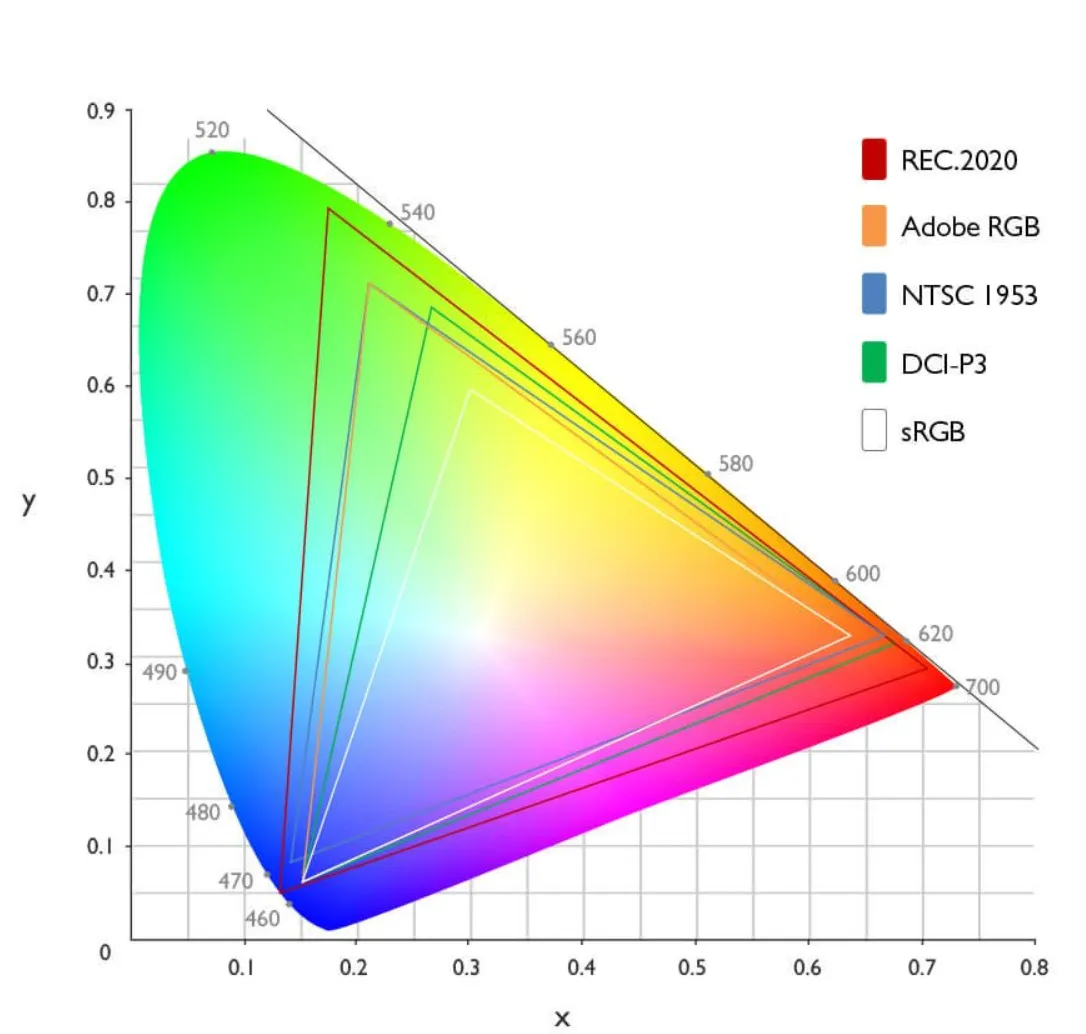
Below I’ve summarised a few colour spaces to help give an understanding on how different output devices may display colour.
| Name | Primary Medium | Key Characteristic |
|---|---|---|
| NTSC 1954 | Analogue Television | The first colour standard for broadcast; notable for using YIQ colour space to remain backwards-compatible with black-and-white television. Some great information here |
| sRGB | Web & Standard Monitors | The universal standard; smallest gamut but highest compatibility. |
| Adobe RGB | Print & Photography | Extended greens/cyans to match CMYK printing capabilities. |
| DCI-P3 | Cinema & Modern Smartphones | High-saturation standard required for HDR content. |
| Rec.2020 | UHD / 8K Television | A massive gamut representing the future of display technology. |
The RGB Colour Model
Section titled “The RGB Colour Model”The RGB Colour model is considered an additive colour model in which the combination of red, green and blue primary colours of light are added together to reproduce a broad array of colours. The RGB model is for sensing, representation and display of images in electronic systems. The model aligns to our perception of colours (Trichromacy).
 Source: Figma’s article “What is RGB”
To form a colour we superimpose three light beams (red, green and blue) either by, emission from black, or reflection from white. Each beam is labelled a component of that colour. The reason the RGB space is considered additive is because if light beams of differing colour (frequency) are superposed in space, their light spectra adds up, resulting in total spectrum.
To map a RGB triplet the component values are treated as positive Cartesian coordinates with a double value clamped between 0 and 1. If you could visualize a cube holding the bounds of the colour space a point with an X (Red), Y (Blue) and Z (green) “coordinate” will represent a colour (more on this shortly).
With this geometric representation additional computations can be applied such as colour similarity by mapping the distance between two given RGB colours.
sRGB Colour Space (and Transfer Function)
Section titled “sRGB Colour Space (and Transfer Function)”On November 5, 1996 Michael Stokes (Hewlett-Packard), Matthew Anderson (Microsoft), Srinivasan Chandrasekar (Microsoft) and Ricardo Motta (Hewlett-Packard) submitted a joint proposal to the W3C titled A Standard Default Color Space for the Internet - sRGB.
Jointly written by HP and Microsoft the paper plays an instrumental role in shaping how we sense colour on computers today.
The tech industry was facing a challenge. Hardware, applications and output devices were all displaying colour information with different standards applied. High end users who needed precision had access to hardware and software which supported a wider gamut whilst lower end entry level devices would be limited in support for such colour spaces. If the problem wasn’t addressed there would be a considerable effort required to maintain the colour display ecosystem.
To address this, the paper put forward a standardised colour space (Standard RGB or sRGB) with the intention to:
- Improve colour fidelity in the desktop environment
- Create a uniform standard for software development
- Confidently communicate colours with minimal overhead
Essentially sRGB is a communication ruleset, a “lingua franca” (common language), made possible by constant parameters adopted to create a common colour language.
To achieve this there are a couple of important factors to consider:
Colorimetric RGB
Section titled “Colorimetric RGB”sRGB uses precise standardised definition of anchor colours, specifically the Rec.709 values for Red, Green Blue and White (D65). The reason REC.709 was chosen was because it matched the phosphors used in the consumer CRT monitor and Television set of the 1990’s ensuring backwards compatibility.
Gamma (Transfer Function)
Section titled “Gamma (Transfer Function)”The proposal provides a a bridged target of gamma suitable for most devices and breaks up the requirement into various subsets.
- Viewing Gamma - Computed Gamma we want to obtain
- Camera Gamma - Derived characteristic from the image sensors standard transfer function.
- CRT Gamma - The gamma of the physical CRT (display).
- LUT Gamma - The gamma of the frame buffer lookup table
- Display Gamma - Computed downstream “display system” gamma
The four specific numbers the proposal settles on
- 1.125 - Target Viewing Gamma (The desired boost for dim environments)
- - Rec.709 Power Function (The mathematical behaviour of the 709 transfer function)
- 2.5 - Physical CRT Gamma (Baseline characteristic for CRT displays in the 90’s)
- 2.2 - The magic number or “New Standard” proposed as the ideal target for the sRGB Display Gamma
To simplify further:
- 1.125 is our goal
- is a constraint of Rec.709
- 2.2 is used to bridge our gap
The solution results in the simple formula:
(This rounded would resolve to 1.125 our target viewing gamma)
The reasoning behind 1.125 is clearly laid out in the proposal and well beyond the scope of what we are discussing here, in simpler terms they understood the colour space would be used in a multitude of environments which still required images to look correct and not washed out.
Definition
Section titled “Definition”The final piece I will touch on at a high level is definition. The key components that were defined as standard:
- The Standard Observer: While based on the CIE 1931 Standard Observer, the sRGB proposal specifically optimised for the “average” human’s response to the phosphors of a CRT monitor. It effectively turned a biological variable into a mathematical constant.
- Reference Viewing Environment: This defined the “room” the observer is in, assuming a dimly lit office and a specific D50 ambient white point. This is why the viewing gamma was necessary (to compensate for the “darker” office surroundings).
- The sRGB Gamut: This is the “triangle” of colours within the CIE 1931 space. Any colour falling outside this triangle is considered “out of gamut” for sRGB and must be re-mapped.
- Render Intent: The inclusion of
render-intentwas a forward-thinking attempt to handle those “out of gamut” colours. It instructed the browser on how to squeeze a wide-gamut image (like a professional photograph) into the smaller sRGB space without losing detail in the highlights or shadows.
Some Cube Code
Section titled “Some Cube Code” To visualise the sRGB transformation think of a cube (see above) and now in code (below):
const points = []for (let r = 0; r <= 1; r += 0.1) { for (let g = 0; g <= 1; g += 0.1) { for (let b = 0; b <= 1; b += 0.1) { points.push(r, g, b) } }}Mapping in increments of 0.1 an 11x11x11 cube which would equate to 1331 unique combinations. Whilst this works for a cube with a single factor of consideration, It is not taking into account the nature of our above pictured cube having corners starting at Red, Green, Blue, White, Magenta and Black.
True sRGB works in 8-bit space providing over 16.7 million unique combinations and takes into account the tracking of index in relation to each other.
(don’t run the below code it generates over 50 million entries)
const points = []const steps = 255
for (let r_i = 0; r_i <= steps; r_i++) {    const r = r_i / steps    for (let g_i = 0; g_i <= steps; g_i++) {        const g = g_i / steps        for (let b_i = 0; b_i <= steps; b_i++) {            const b = b_i / steps            points.push(r, g, b)        }    }}
The above “cube code” with the additional parameter in mind, return coordinates to the value of .
The axis of the cube is represented as such:
- X-axis = Red (R)
- Y-axis = Green (G)
- Z-axis = Blue (B)
Charting the colour cube is as simple as plugging in our coordinates and setting sail - see some example coordinates below:
| Coordinate (x,y,z) | Resulting Color | Description |
|---|---|---|
| Black | The Origin (No light) | |
| Red | Max Red, no Green or Blue | |
| Green | Max Green, no Red or Blue | |
| Blue | Max Blue, no Red or Green | |
| Yellow | Red + Green (Additive) | |
| Cyan | Green + Blue (Additive) | |
| Magenta | Red + Blue (Additive) | |
| White (D65) | All primaries at max |
An important distinction I needed to wrap my head around:
The mapping of the colour space (setting the coordinates) is linear, the issue is the adjustment of colour.
Remember all that stuff about gamma? Now that the coordinates are mapped I found that the relationship between coordinates and gamma to be non-linear. This was the main reason why the sRGB transformation was not suitable for my computed colour scheme exercise (I’ll show a visual example shortly).
When you adjust only the Red, Green or Blue sliders on an sRGB colour picker the results do not necessarily meet expectation.
Side note: There is so much more to explore around gamma specifically, maybe another time.
Vector Manipulation
Section titled “Vector Manipulation”If it wasn’t already implied the combination of vectors in an additive fashion allow for us to come up with a colour. As an example adding Pure Red and Pure Green should give us Yellow.
As it was aptly put by Troy from hg2dc
What the F$%k Happens When We Change an RGB Slider Value?
You are increasing or decreasing the emission intensity of one of the three RGB lights
The transformation lends itself to great precision providing a very large number of combinations, however, the intuitive expectations become difficult to meet.
As an example let’s take Red If we wanted to make this a “Deeper Red” programmatically we would need to have either reviewed and memorised the coordinates of the red we are seeking or manipulated our RGB values and reviewed incrementally until we were happy this could land us at (a slightly darker red).
Even with clamped helper values in the RGB space we would still need to manipulate our green and blue values to find the output we desire.
Because of the biological quirks ([discussed earlier](#Colour is a Sensation)) — like our heightened sensitivity to Green —moving a coordinate by 0.1 on the Green axis “feels” much more dramatic than a 0.1 move on the Blue axis.
This “overhead” in managing our perception and sense is why It is harder to apply a programmatic approach to computed Themes in the sRGB space. That’s why I needed to look at alternatives like HSV and HSL.
HSV and HSL
Section titled “HSV and HSL”HSV and HSL comes from the desire to have a natural system in which it’s easier to adjust a colour scheme, providing more intuitive functions familiar to the standard observer (humans). The transformations are inspired from art where a base colour (hue) is picked adding white (tint), black (shade), or grey (tone/saturation).
 Source: Wikipedia Article on HSV and HSL
sRGB is hardware-focussed valuing precision, where as HSL/HSV accommodates human intuition. The transformations for HSL/HSV are implemented by mapping cartesian RGB values into a cylindrical co-ordinate system.
To apply the transformation (assuming RGB values are normalized to the range ) a pre-calculation determines the peak and floor of each RGB triplet with:
- (This is the Chroma , or the distance from the neutral grey axis)
We use the above values in both Value and Saturation so it’s important to remember them.
 Source: Wikipedia Article on HSV and HSL
Visualising the cylinder with a colour space mapped to it (like below) - HSL and HSV provide a transformation option where specific choices for Lightness (or Brightness in the case of HSV), Hue and Saturation become special cases, unified by adjustable parameters - also known as a parametric framework.
 Source: Wikipedia Article on HSV and HSL
I will try to summarise Hue, Saturation and Value (or lightness/intensity) in its transformative context. I did note through a lot of my readings that definition for these terms is going to have variance based on context - so keep that in mind when exploring other areas.
TLDR: Hue is an angle on our unwrapped colour cylinder normalised to to represent a perceived colour.
 Source: Wikipedia Article on Hue
I came to find this particular definition from Color Appearance Models by Mark D. Fairchild as a great starting point for my understanding of hue.
Hue - Attribute of a visual sensation according to which an area appears to be similar to one of the perceived colors; red, yellow, green and blue or to a combination of two of them.
In a HSV/HSL model both hue and chroma are parameters which when applied navigate our coordinates with different effect.
To have a reference for hue first the RGB cube tilted with the black vertex on the bottom is projected to a hexagonal shape.
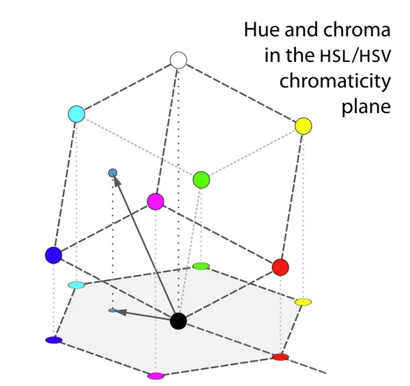
Each projected vertex which constitutes points between edges in our hexagon become the anchor vectors with the definition of hue being roughly the angle of the vector to a point in the projection, with red at 0°
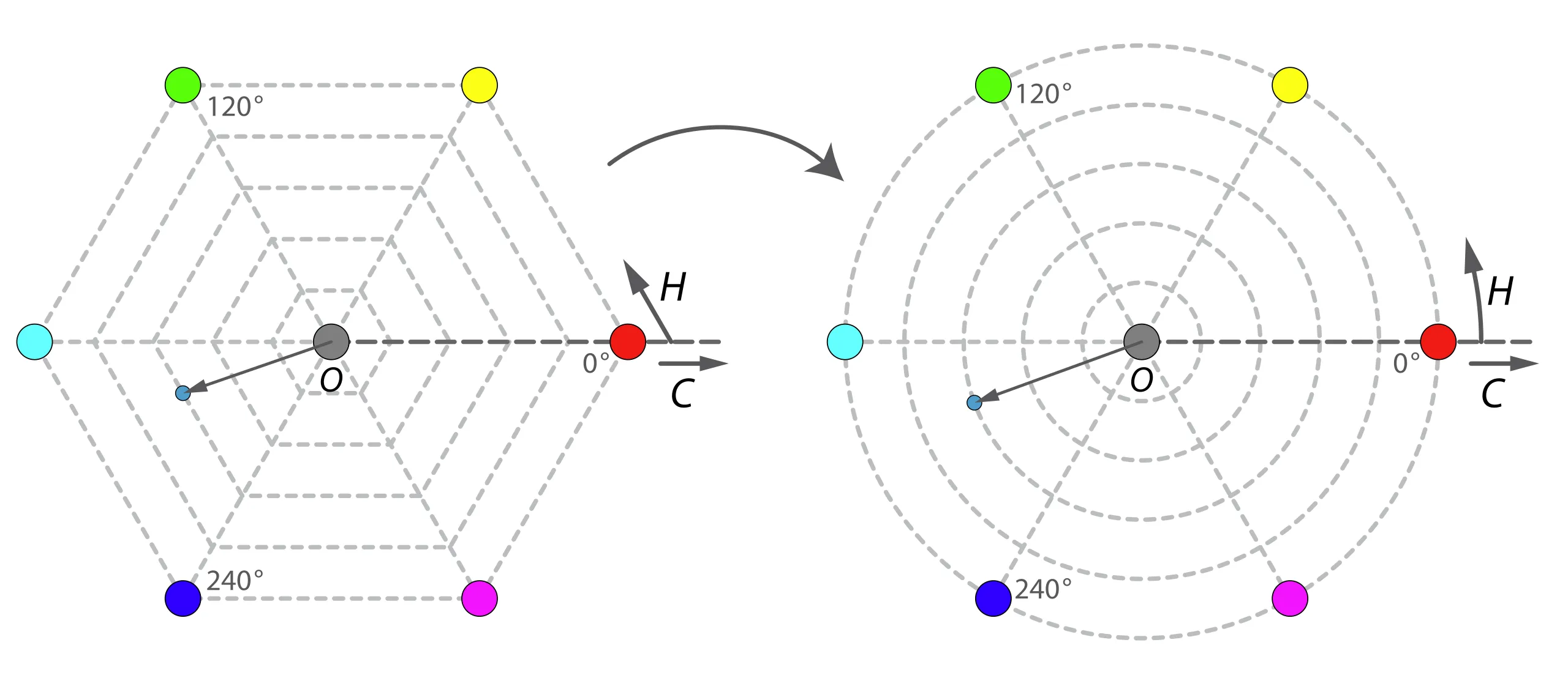
As such Hue is the angular component and is typically measured in degrees. As an example from the above image a yellow hue would sit at roughly - if H is less then 0 then it would add to normalise it.
Saturation
Section titled “Saturation”TLDR: In HSV saturation is simply the chroma divide by the maximum value .
Saturation is the “colourfulness of an area judged in proportion to its brightness” (17-1136)
Source The Difference Between Chroma and Saturation*
The math behind the generalised saturation functions is certainly a little above my paygrade however I will try to keep it simple.
Saturation is traditionally calculated at the length of a vector (calculation varied based on weightings - see lightness below) divided by the length of the extension of this vector to the surface of the RGB cube. Dependant on the brightness function creating a parametric system which allows us to keep a conic or bi-conic form of transformation space, intimately utilises brightness functions and takes into account specific co-ordinates on the brightness slope. Those poitns are then used in a calculation to divide our length accordingly.
Brightness or Lightness Value (ft. Intensity)
Section titled “Brightness or Lightness Value (ft. Intensity)”TLDR: In HSV = Value = Max of RGB Triplet - the below gives more detail and insight and can be skipped if it’s not of interest.
HSL, HSV and HSI all use a form of luminous intensity ( ) as a subjective measure of brightness - this is derived from the Generalized Lightness Hue and Saturation (GLHS) colour model.
The equation below provides insight into how the brightness is calculated:
- Assuming c as a colour value.
- , and as user set weights (generally 0 or 1)
- represents the minimum value amongst the values
- represents the median of the values
- represents the maximum value amongst the
- Finally a few constraints -
- and
Specific values of the weights give the brightness functions used by the common cylindrical colour spaces:
| Model | , , | Description | Resulting Formula |
|---|---|---|---|
| HSV | Value determined by strongest colour component | ||
| HSL | Lightness is the average of the most and least saturated components | ||
| HSI | Intensity is the true average of all three RGB components. |
Why HSV?
Section titled “Why HSV?”So now that the RGB space is clearly laid out, we need to consider colour matching in a very basic sense, if my theme engine was to take some seed colours for Primary, Secondary, Tertiary and Neutral how do I expand this system with multiple derivative shades in a formulaic fashion.
Lets take hex code #4287f5 as our seed colour - RGB 66, 135, 245

And here is a subjectively lighter shade of blue #7cadfc - RGB 124, 173, 252

As the nature of travelling between colours (adjusting gamma) in sRGB is non linear there is no defined step change across all three vectors that will yield a consistent results. If we were to take the above logic then a stepped change of across our vectors should have a similar result on a green colour. Lets try it!
Here is our green seed hex #30d42a - RGB 48, 212, 42

Here if we apply the same modifiers to our RGB coordinates we map to RGB 106, 201, 49 which results in hex #6ac931 In comparison to our blue shade variant the green looks washed out and “not quite right”.

You may also notice that the green variation feels different compared to blue. This is because the standard observer (human being) has an uneven sensitivity across the spectrum: we are most sensitive to changes in Green, followed by Red, and least sensitive to Blue. This is why a fixed mathematical shift in RGB results in wildly different perceptual shifts depending on the starting colour.
To demonstrate this point I will pick two seed colours and apply the same step change of four times and put them side by side for comparison. (The top is the seed colour picked at random).
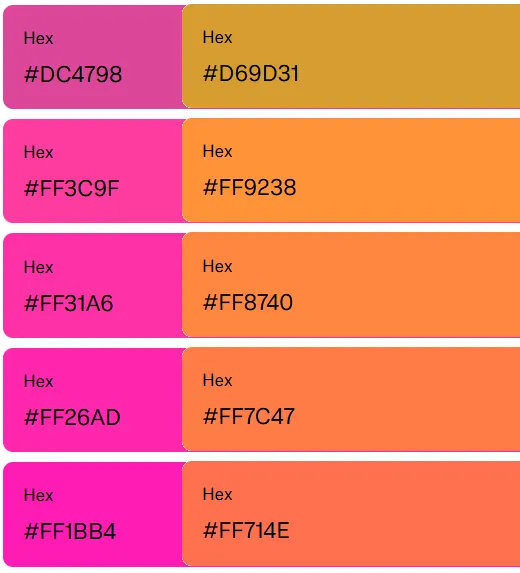
The results tend to feel washed out, and the uniform intuitive option will not resonate across a swatch.
Now let’s apply the same exercise in the HSV space. First and foremost we are not going to play with Hue or Saturation only Value (Brightness Factor!).
Now one thing I didn’t mention is this project is being done in Java (sorry in advance) so the code here is going to be a bit verbose but should be easy to follow:
public record ColorShade(String name, String hex, Color color) {};
private List<ColorShade> generateShades(String baseColorName, String hexColor) {  Color baseColor = Color.web(hexColor);  List<ColorShade> palette = new ArrayList<>();  double[] brightnessFactors = {1.5, 1.2, 1.0, 0.8, 0.5};  String[] labels = {"100", "300", "500", "700", "900"};  for (int i = 0; i < brightnessFactors.length; i++) {    Color shadeColor = baseColor.deriveColor(0, 1.0, brightnessFactors[i], 1.0);    String shadeName = baseColorName + "-" + labels[i];    ColorShade shadeToAppend = new ColorShade(      shadeName,      toHexString(shadeColor),      shadeColor    );    palette.add(shadeToAppend);  }  return palette;}
By applying a standardised multiplier to our base colours brightness we get some interesting results! lets take our colours we used in our sRGB approach and apply the same multipliers:
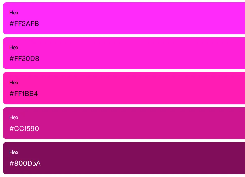
Lets take our original purple hex #FF1BB4 in our function the 1.0 or “500” shade is considered the centre and the results show a noticeable difference.
and now the same with the #FF714E coral orange.
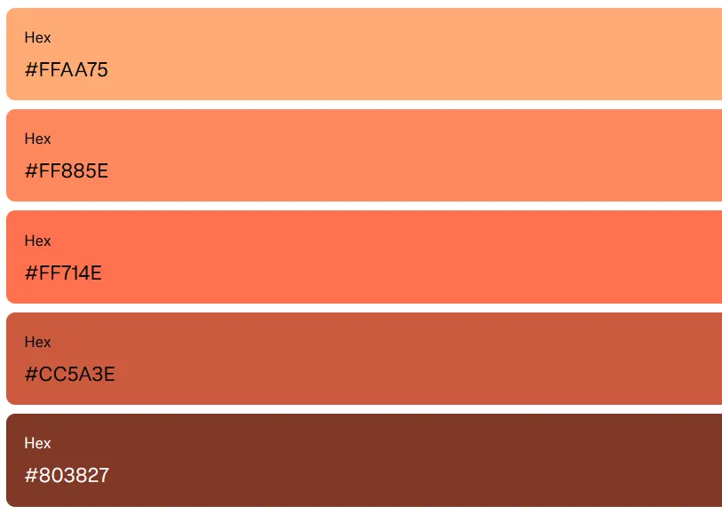
The immediate uniformity in shade application and the effect of having a parameter that gives us consistent results becomes apparent!
Conclusion
Section titled “Conclusion”This was a really long way of saying if you want to automate theming a parametric system like HSV/HSL or HSI and now the new standards in CSS like OKCLH (which supports a wider gamut of colours in the p3 space) are going to allow for you to have consistent automated results.
Until next time!
Reading Sources
Section titled “Reading Sources”- Color Appearance Models - Mark D. Fairchild
- GLHS: A Generalized Lightness, Hue, and Saturation Color Model Levkowitz H. Herman G.T.
- The taming of the hue, saturation and brightness colour space - Alan Hanbury
- Color Management - Chris Brejon
- Beginners Guide to Colorimetry - Chandler Abraham
- Hitchhikers Guide to Digital Colour
- How do we see color? - Pantone
- CIE Informational Brochure
- A Standard Default Color Space for the Internet - sRGB - Microsoft and HP
- CIE 1931 Color Space - Wikipedia
- HSV and HSL - Wikipedia*
- Photoreceptors - American Academy of Ophthalmology
- Difference Between Chroma
- Figma Colour Palette Generator